The Movie Dataset
This is an exploratory data analysis exercise that uses this movies dataset.
Inspecting the data
The csv file contains 3201 movies. For each movie we have the following attributes (not all the movies have all the attributes set):
0: "Title" 1: "US Gross" 2: "Worldwide Gross" 3: "US DVD Sales" 4: "Production Budget"
5: "Release Date" 6: "MPAA Rating" 7: "Running Time (min)" 8: "Distributor"
9: "Source" 10: "Major Genre" 11: "Creative Type" 12: "Director"
13: "Rotten Tomatoes Rating" 14: "IMDB Rating" 15: "IMDB Votes"
Let's inspect the number of uniq values available per attribute on the dataset:
US Gross 3061 | Worldwide Gross 3075 | US DVD Sales 565 | Production Budget 382
Release Date 1604| MPAA Rating 8 | Running Time (min) 110 | Distributor 175
Source 19 | Major Genre 13 | Creative Type 10 | Director 551
Rotten Tomatoes Rating 101 | IMDB Rating 78 | IMDB Votes 2840
Distributions for the numerical attributes
Let's take a look to how the values distribute for the numerical variables in the dataset. I want to do that to see if something interesting comes out so we can dig a bit deeper.
First, there a few entries with incorrect release dates. I apply various filters to clean up the data. After that bit of cleaning, I end up with 1372 movies.
Now that I know a bit more about the dataset, what are some interesting questions?
Questions
Are movies during the holidays more likely to have worse ratings?
To answer that we need the budget, ratings (remember we have rotten tomatoes and imdb) and the release date. Let's hack... Use the following dropdowns to set the start and end dates to work on. Some years may not have any movies on them. Specially after cleaning the entries and making sure they have all the data we need. Pink squares indicate "holiday" months. BTW, the read dot in the viz is for back to the future. One of my favorite movies of all time.
Year start: Year end:
I don't see any particular trend in the data that suggest bad movies (low ratings) with high revenue for the holidays. We should see more dots in the bottom right quadrant for the summer and Christmas. Each dotplot contains data for a particular month starting with January (first dotplot) and ending in December (bottom right dotplot).
Trying to answer the same question with a different viz
Here, each row represents a year and each square is a month. The value of each square contains the average rating for all the movies on that particular month. The value ranges from 0 to 100 and it is color encoded using this color scheme (A white entry means we don't have movies for that particular month).

Here is the same data and viz but using this color scheme:

A lot of filtering and cleaning and digging here but I can't confirm my hypothesis. I tried to look at both ratings by combining them when available.
One extra feature: You can click on a dot and look at the underlying data (open your console in the browser first).
Is there an overlap in interest between US and the rest of the world?
Here I am plotting the revenue for the movie in the US (x) and the rest of the world (y). It seems there is:Are there directors releasing consistently high rated movies?
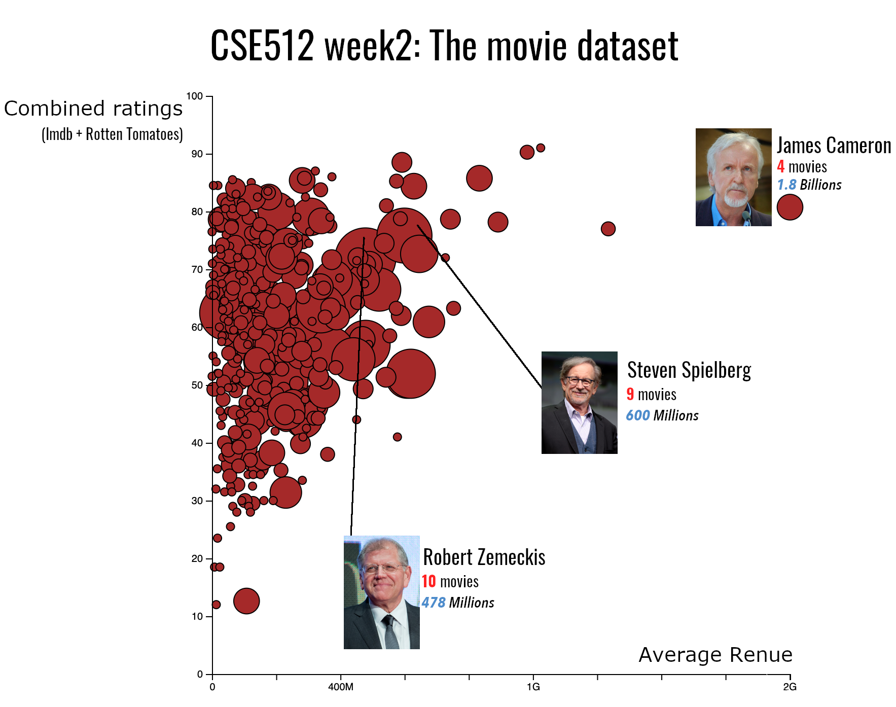
Here each dot is a director. The Axes show average revenue and average ratings for all of their movies. The size of the dot encodes the number of movies for the director. Scroll over a dot to get the director name and the movies.
Well, James Cameron is a gold mine for movie companies. Robert Zemeckis and Steven Spilberg are also consisentely releasing high revenue (and ratings) movies. That's interesting.
Final Result
